YMCA | Brand Hub

Everyone should have a fair chance to discover who they are and what they can become.

National Brand Guidelines
Divider
Divider

Our Logo

The purpose logo stands for YMCA and everything we represent. That means everything to do with who we are, what we do, and why we do it. As such, it should appear on almost everything that signifies our presence.


How we use our logo:

Digital

✓ Social media — To appear in header image and profile photo (EN / CYM)

✓ Websites — To appear top-left on all pages and web banners

✓ Email signatures — To appear within e-mail footer

✓ E-newsletters — To appear within header

✓ PowerPoint & AV — To appear at least once in presentation


Print

✓ Posters, leaflets and flyers — To be appear at least once

✓ Publications, reports and newsletters — To appear on covers

✓ Press releases — To appear at least once

✓ Letterheads & compliment slips — To be appear at least once

✓ Name Badges & business cards — To appear at least once

✓ Roller banners and exhibitions — To appear at least once where appropriate

✓ Merchandise & clothing — To appear at least once where appropriate


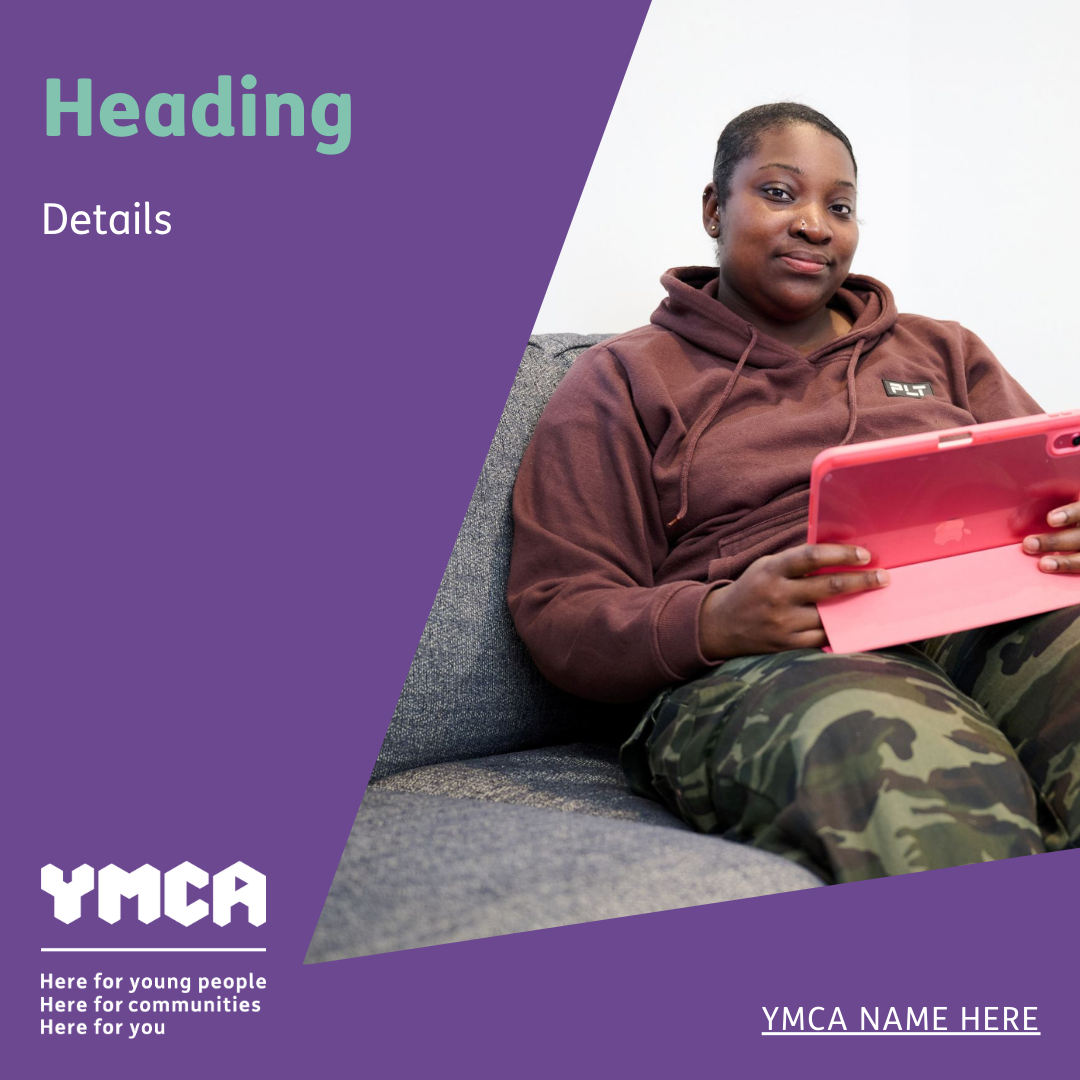
Customisable templates


The standard logo must be used for partner endorsement, or if the purpose logo is impractical for size or cost reasons (e.g. uniforms, signage, and vehicle livery)
Divider

Our Purpose Headline

Our purpose headline speaks about the people and communities where we work, and why we do what we do as YMCA, from their point of view. It gets to the heart of what we do every day, but using words and ideas that other people can relate to.


Everyone should have a fair chance to discover who they are and what they can become.


Use it widely, repeatedly and consistently to help increase empathy, energy and high levels of understanding and support so we can reach and help more people.

How we use our purpose headline:

Digital

✓ Social media — To appear in profile description / ‘About us’ section

✓ Websites — To appear on homepage below carousel

✓ Email signatures — To appear within footer when appropriate

✓ E-newsletters — To appear within header or footer

✓ PowerPoint & AV — To appear at least once in presentation


Print

✓ Posters, leaflets and flyers — To be appear when appropriate

✓ Publications, reports and newsletters — To appear at least once

✓ Press releases — To appear within notes to editors

✓ Letterheads & compliment slips — To be appear when appropriate

✓ Business cards — To appear on reverse of card

Divider

Our Purpose Statement

The statement of purpose helps us engage external audiences. We know from testing that people feel it shows us as relevant, unique and positive in a way that is clear and believable, and it significantly increases people’s intention to donate or support us in other ways.


YMCA believes in fairness and opportunity. There are essential building blocks for a full and rewarding life: a safe home; acceptance;  guidance; friendship; physical and mental health; academic support; employment skills; and access to real opportunities. Many young people have never known these things; other people have lost one or more as they grew up, but we all need them. All of us. At YMCA, we provide these critical foundations for a fresh, strong start for young people and a better quality of life in the community.


How we use our purpose statement:

✓ Websites — To appear in full on ‘About us’ page

✓ Press releases — To appear in full within notes to editors


This paragraph has many additional uses. Use it as a source of ideas, words and phrases for other public-facing items — such as social media posts, headlines, YMCA clothing, posters to presentations, and more. In these cases, you don’t need to use the whole paragraph — just take the phrases and ideas that work for that particular use.


Core Messaging Framework 


Divider

Our Work Areas

Our five work areas, along with their definitions, quickly communicate how YMCA works through the programmes and services we offer. Use them to increase support and reach more people, and we must find ways to show and talk about our work areas. 


Family & Youth Work
Creating positive outcomes with children and young people in their communities, and support for families with nursery, day care, holiday and year-round programmes.


Health & Wellbeing
Gyms, sport and recreation for fitness, and community hubs for classes, social connection and collaborations.


Housing
Providing a home and personalised support services for a fresh start in life.


Support & Advice
A safe place to talk and get help through guided groups, mentoring, counselling, and mental health services.


Training & Education
Opportunities to gain qualifications, skills and employment.

How to use our work area titles and definitions: 

✓ Websites — To appear on work area pages and navigation menus


Include them on your website, but also look for other opportunities to share them. It’s important to show the work areas with the definitions as written wherever we refer to them. Use the Core Messaging Framework for examples of how to use them on other digital and print platforms.


Core Messaging Framework 


Divider

Our Colours

How we use our colours:

Work areas

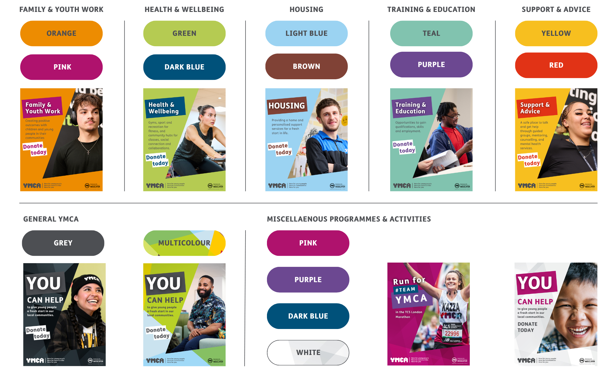
To differentiate YMCA’s wide range of activities, there are colour schemes for each work area. When focusing on a single work area, we must use the appropriate designated colour palette.


General

Where we have a focus on YMCA as a whole or not a particular work area, YMCA core grey should be used as the predominant colour along with any single colour or combination from the brand colour palette.


Always refer to the indexed colour values on page 25 of the brand guidelines.


A range of richly colourful patterns can also be used to add vibrancy.


Download our colour patterns  |  Customisable templates

Family & Youth Work


copy colour

#ed8c01

copy colour

#af126d

copy colour

#4d4f53

copy colour

#ffffff

4/4 items

Health & Wellbeing

copy colour

#b5cb52

copy colour

#00517a

copy colour

#4d4f53

copy colour

#ffffff

4/4 items

Housing

copy colour

#9bd3f2

copy colour

#804236

copy colour

#4d4f53

copy colour

#ffffff

4/4 items

Support & Advice

copy colour

#f7bf1f

copy colour

#e13316

copy colour

#4d4f53

copy colour

#ffffff

4/4 items

Training & Education

copy colour

#81c3af

copy colour

#6c4891

copy colour

#4d4f53

copy colour

#ffffff

4/4 items

Divider

Our Boilerplate

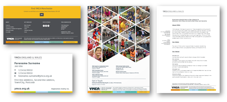
YMCA’s boilerplate contains messaging about our core focus as a Federation. The boilerplate is available in English and Welsh and various colour modes.

How we use our boilerplate:

✓ Websites — To appear within footer on all webpages

✓ Annual reports and corporate documents — To appear on back cover

✓ Press releases — To appear within footer of document

✓ Letterheads & compliment slips — To be appear within footer of document

✓ Name badges & business cards — Thin colour strip to appear along bottom

✓ Roller banners and exhibitions — To appear within footer
 

Customisable templates

Divider

Our Imagery

All images we use should reflect our vision, values and purpose, and best reflect what we are trying to communicate. Ask yourself:


Is it empowering? We always preserve the dignity of our subjects.


Is it genuine? Avoiding staged emotion and stereotypes.


Is it respectful? We do not perpetuate or reinforce negative stereotypes.


Is it considered? Will it really achieve your desired reaction?


Download Photography

Divider

Our Font

The main font for all YMCA communications is FS ME. To use this font in Adobe Creative Cloud, please contact [email protected] or select a branded Canva template.
When FS Me is not available, select our secondary font: VERDANA
Divider

Helpful Links & Recommended Suppliers

Faulkner Media Solutions  |  Faulkner Ordering Site


L&S Printing  |  L&S Ordering site 


LCM Group  |  Contact


For agencies and freelancers working with YMCA, download national brand assets:

Select all
file

YMCA-National-Brand.zip

1/1 items

Divider

Brand Templates

Find customisable documents to create high-quality content using the national brand guidelines.

View Templates